Controlling output devices (with a cloud dashboard)
Now we need to build a web dashboard to control the LED. For this create an account on cloud.boltiot.com if you have not already.
Just follow these simple steps:
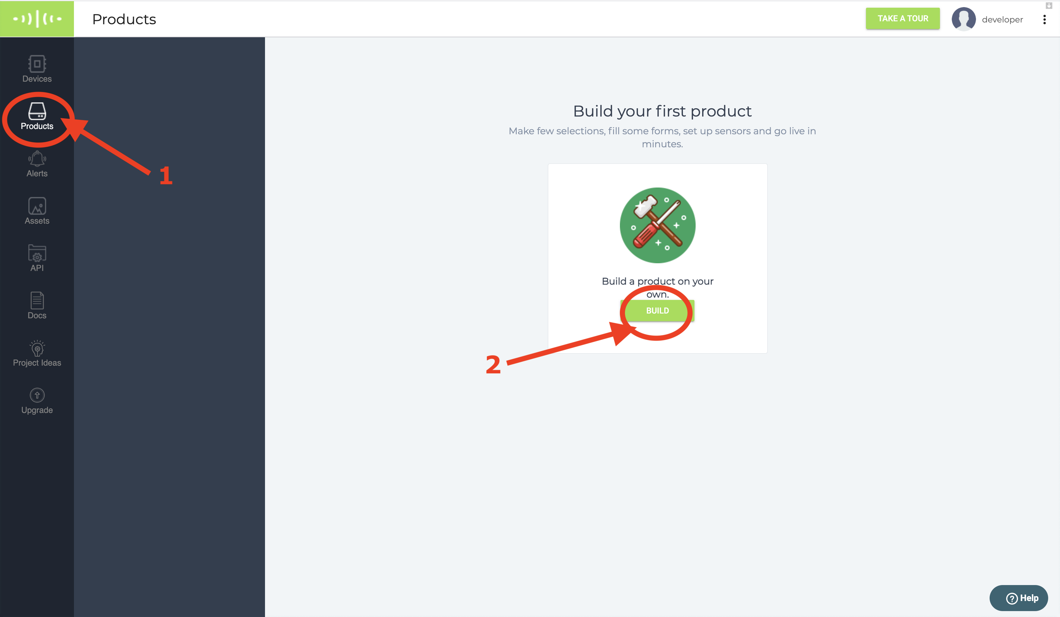
Step 1: Login into cloud.boltiot.com and click on the 'Product' tab.
Step 2: If you have not created any product before then click on the 'Build' button as shown in the image.
👉 Note: If you have created a product in past then click on + Add Product button.
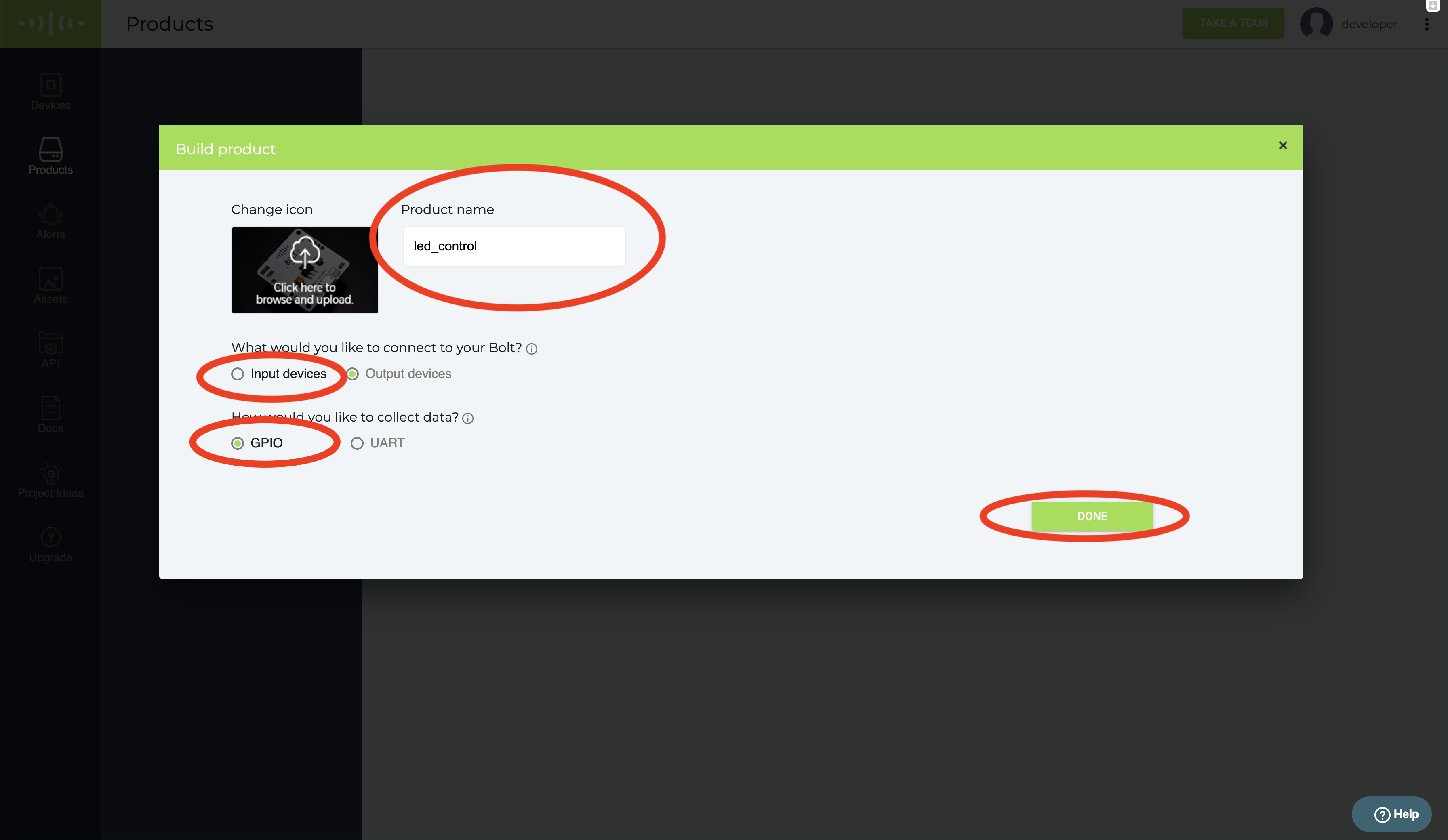
Step 3: Give a suitable name to your product. I have given the name as led_control
Step 4: Answer a few questions asked:
What would you like to connect to your Bolt? will be an Output device since LED is an
output devise.
How would you like to collect data? will be GPIO for this project.
Step 5: Click on Done to create the product
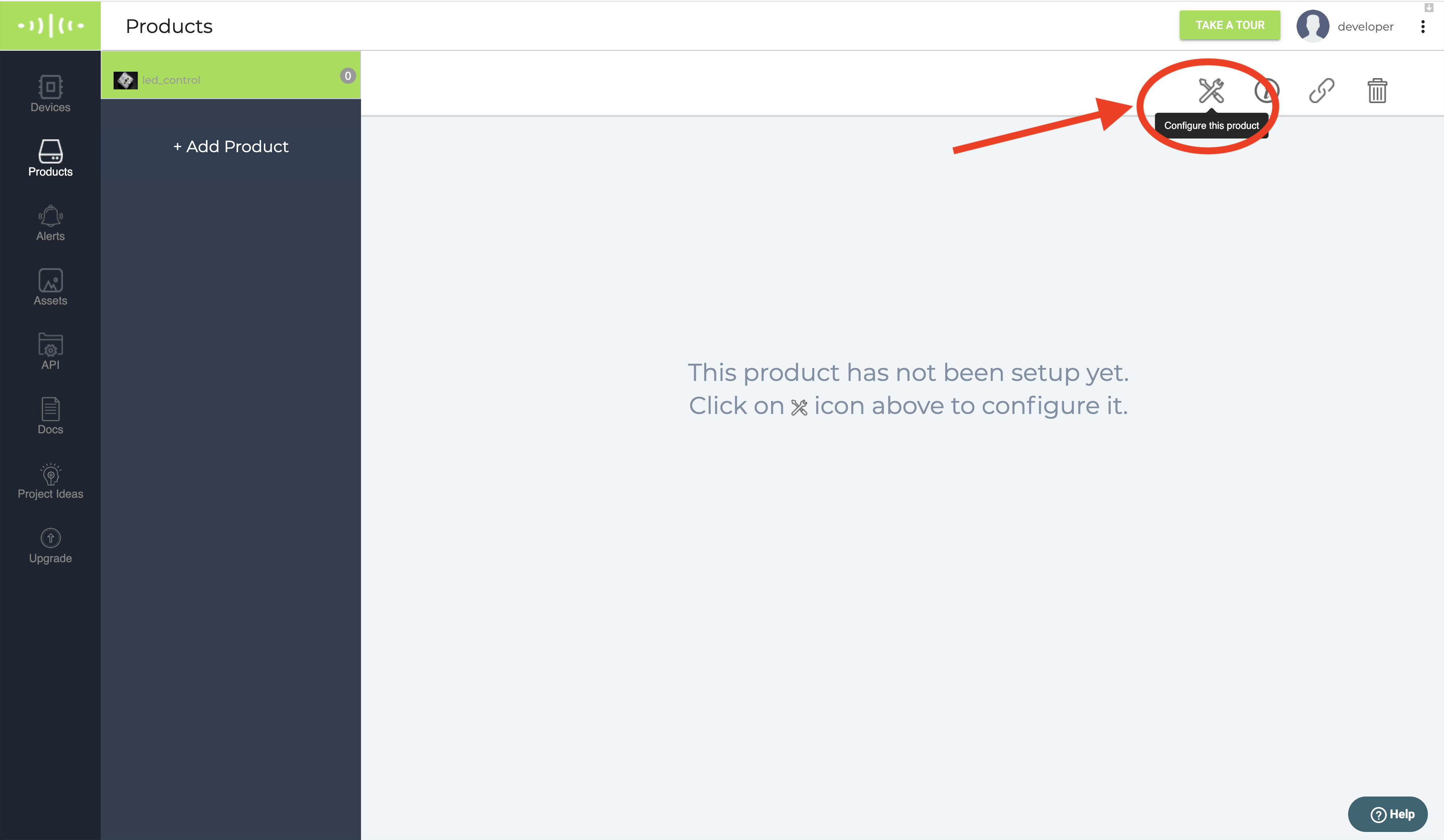
Step 6: We will now write the code for this product we have created. For this click on Configure button.
Step 7: Moving to the Code tab
- Here you have two tabs on top. Hardware and Code.
- When you work with output devices the Hardware tab is not required. You may ignore it and click on the Code tab.
Note: We work with the hardware tab when we are setting up input devices as shown in this tutorial: Temperature monitoring system using LM35 (Temperature sensor)
Note This code will only work if you choose the .js extension from the code tab. This feature will work with a graph and without graph code. If you write this code inside your graph code, then the graph will come first and then the control buttons will appear.
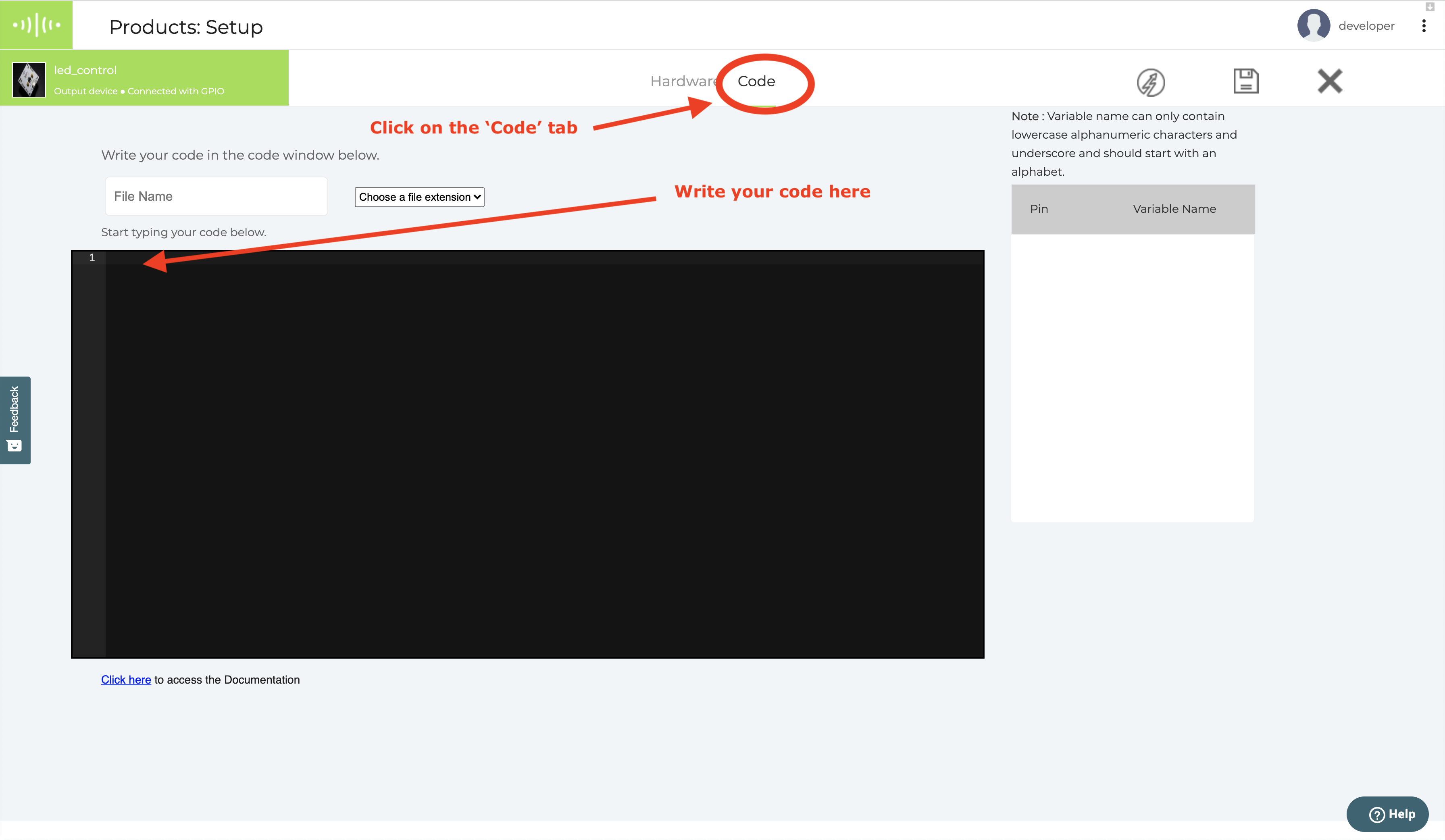
Step 8: We will write our first command to control the LED. This command will add a button on our dashboard.
singleButton({ name : "", action :"", pin : "", value : ""})
Syntax explanation
Name - the name of the button that will appear on the page.
action - action button is the name of the command that will be executed on the click of the button. The commands are below:
- digitalWrite
- analogWrite
pin - pin number where you want to send the command. It could be
- A0, 0, 1, 2, 3, 4
value - The state of the pin. It could be
- HIGH - On digital pins
- LOW - On digital pin
- 0-255 - On analog pin
Here is how the final code that we will write look. This is assuming that the LED is connected to Pin 0.
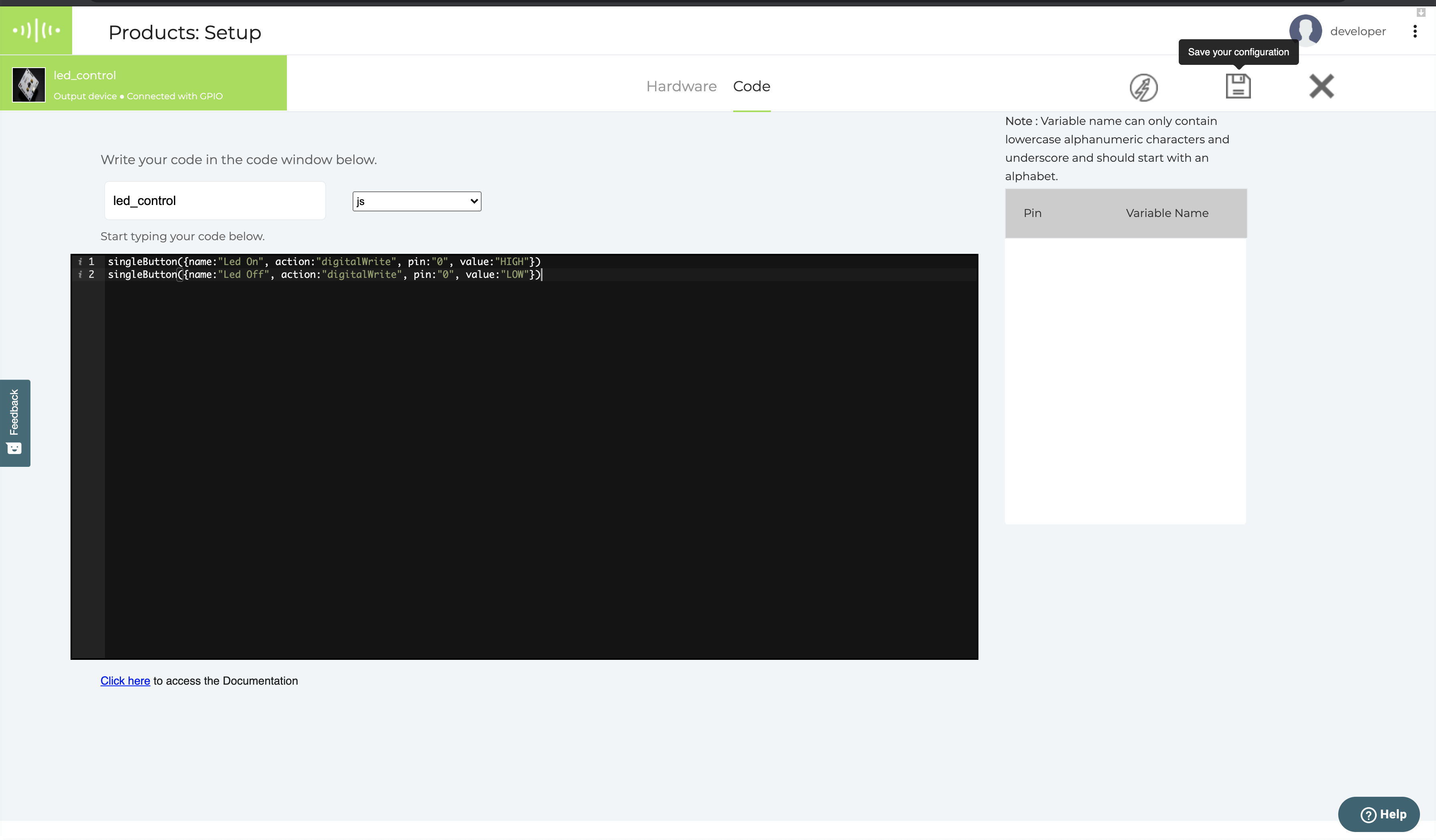
singleButton({name:"Led On", action:"digitalWrite", pin:"0", value:"HIGH"})
Step 9: We will now add one more button to turn off the LED. After adding the additional button the code will look as given below.
singleButton({name:"Led On", action:"digitalWrite", pin:"0", value:"HIGH"})
singleButton({name:"Led Off", action:"digitalWrite", pin:"0", value:"LOW"})
Step 10: Give a suitable name to the file. I gave the name led_control
Step 11: Save the file with .js extension. since this is a Javascript code.
Step 12 Your screen will look as shown below. Click on the floppy disk icon in the top right-hand side corner to save.
Step 13 Linking the product to a device:
- Linking the product to a device will allow the device to function with the code you have written as part of the product.
- Before you link the device, make sure that you have connected the device to the cloud account as given in the section Text tutorial: Setup and build first project
- To link the device, close the configuration section
- Then click on the 🔗 link button in the top right-hand corner.
- Choose the WiFi module you want to link this product code to.
- Press Done.
- Your device is now linked and will show in the list of devices linked
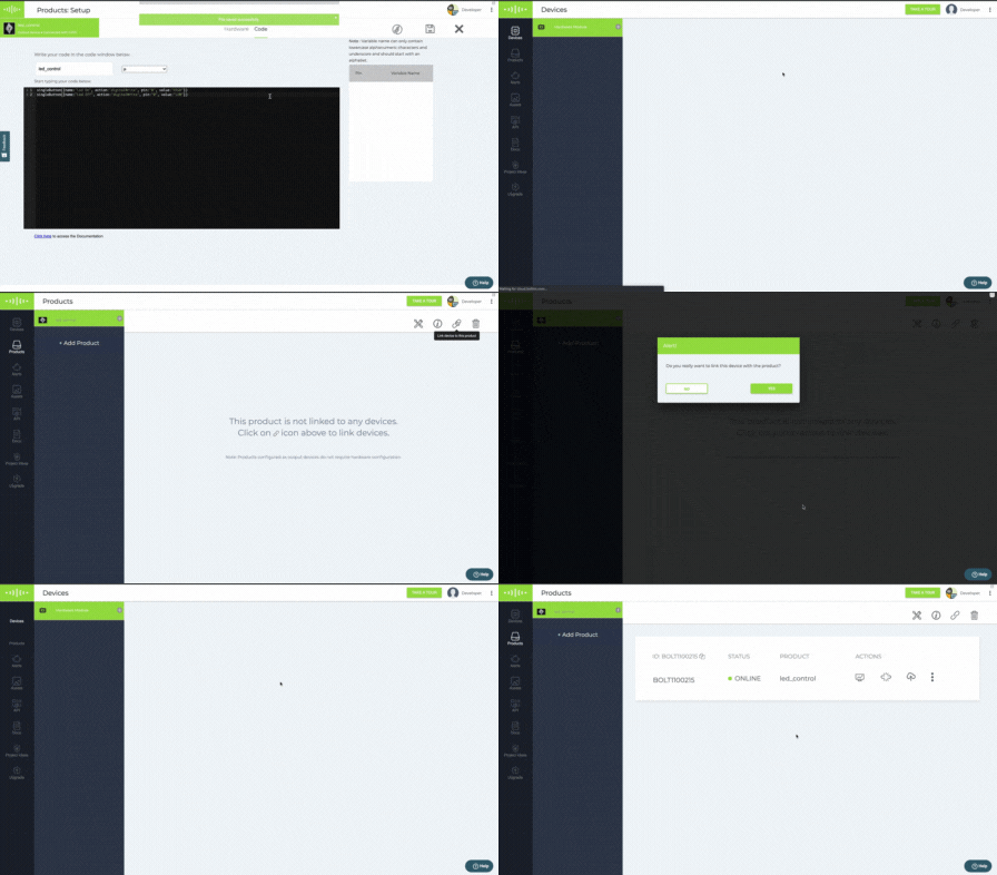
Steps to link a device and a product.
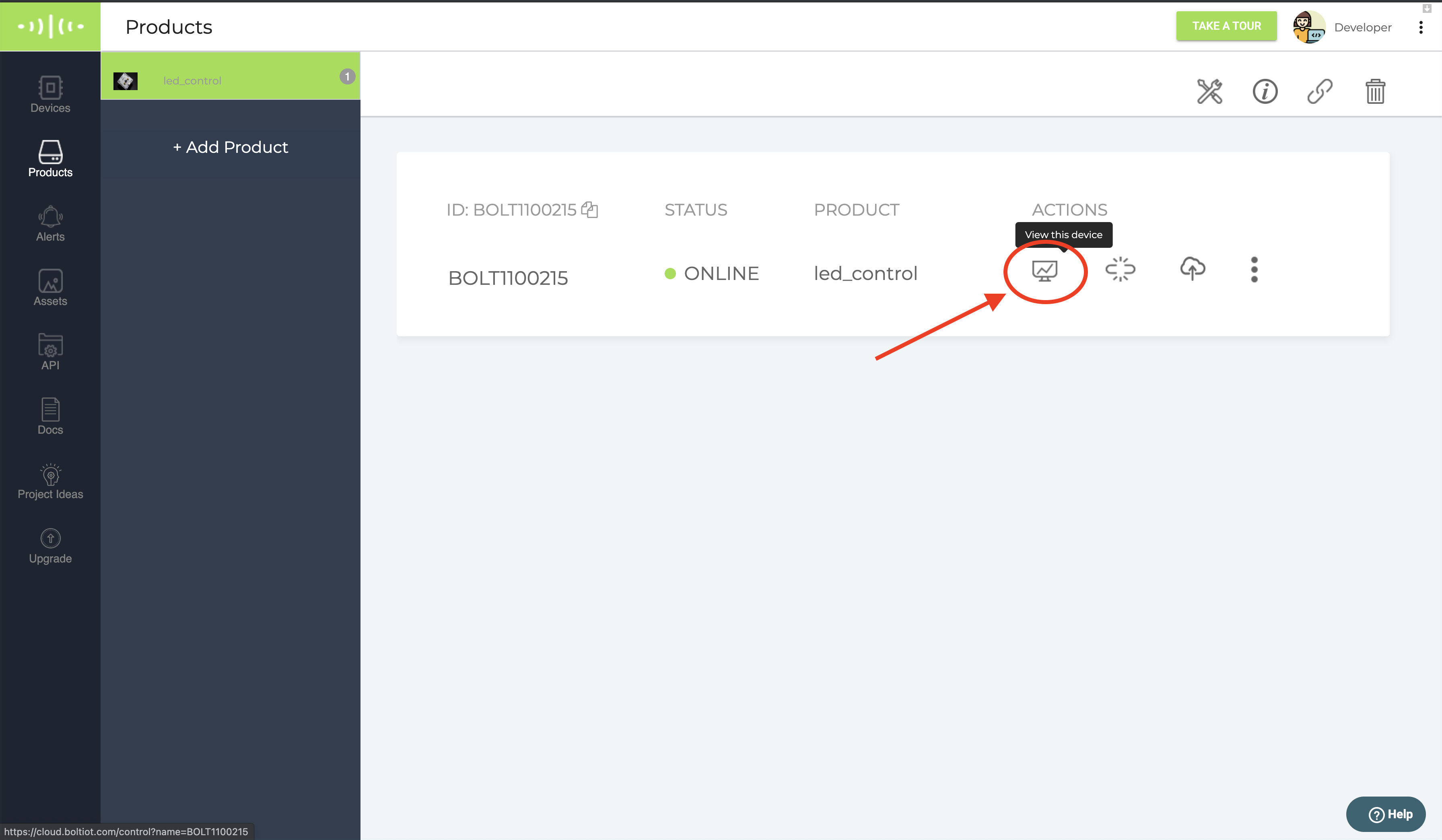
Step 14: Click on the 🖥 'View this device" icon (first icon under the Actions) to see your dashboard.
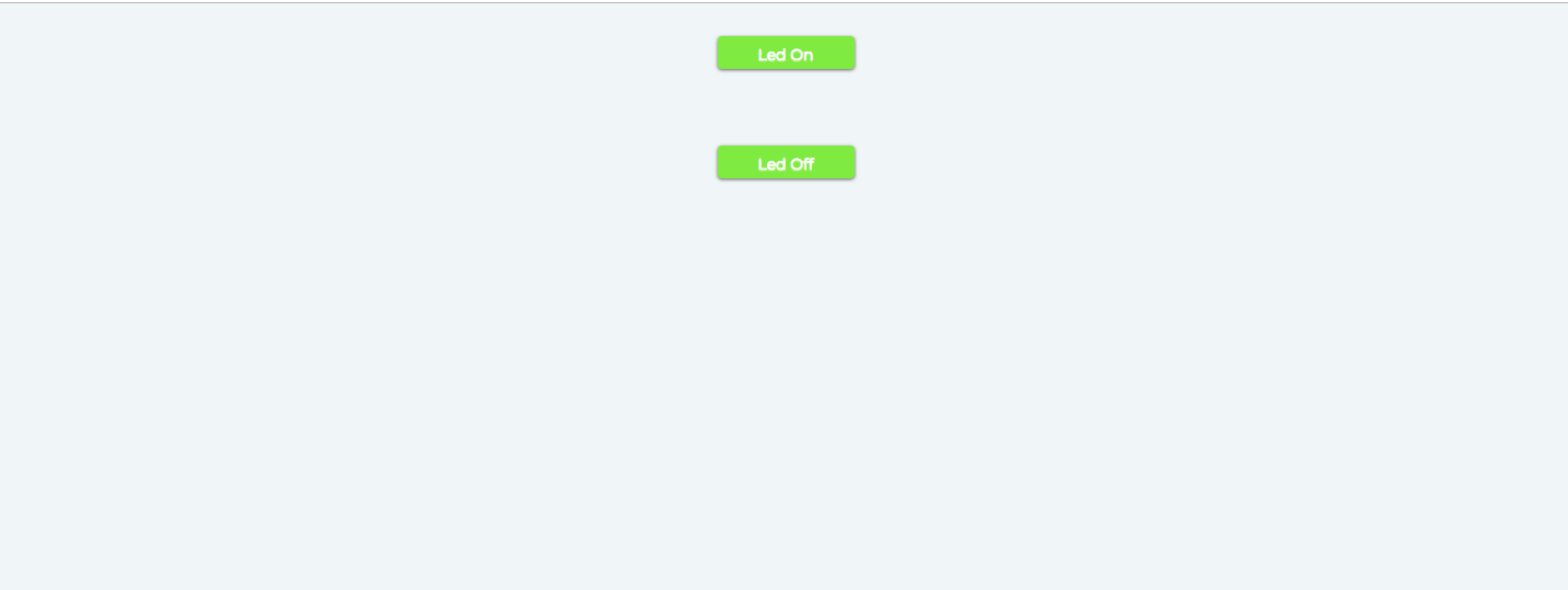
Step 15: Click on the buttons on the dashboard you have created and watch the magic. 🎉
Customising your dashboard
You may customise your page as per your preference. Here are additional customisation options that you may use.
| Syntax | Parameter(s) | Description |
|---|---|---|
| bgcolor | color code | The bgcolor attribute specifies the background color of the button. The default color for the bgcolor is #9BDF46 |
| shape | rectangle,circle | Shape property will specify the shape of the button. The default shape for button is rectangle. |
| align | left, center, right | The align attribute specifies the horizontal alignment of the button. By default the button is center aligned. |
| text_color | color code | You can set the color of text using text_color parameter. The default text color is white. |
Example of Extra customization
singleButton({name:"Led On", action:"digitalWrite",
              pin:"0", value:"HIGH",bgcolor:"green",
              shape:"rectangle",align:"left","text_color":"white" })

singleButton({name:"Led Off", action:"digitalWrite",
              pin:"0", value:"LOW", bgcolor:"red",
              shape:"rectangle", align:"left", text_color:"black"})

singleButton({name:"Fan On", action:"analogWrite",
              pin:"0", value:"230",bgcolor:"#ffa500",
              shape:"circle", align:"right","text_color":"white" })

singleButton({name:"Fan Off", action:"analogWrite",
              pin:"0", value:"0",bgcolor:"#6a5acd",
              shape:"circle", align:"right", text_color:"white"})

Dual Button
The dual button will create an object to create two adjacent buttons. You can add different actions to each button. Both buttons will be center aligned by default.
Syntax
var dual = dualButton(align);
dual.first_button({name :"", action :"", pin :"", value :"", text_color:""})
dual.second_button({name :"", action :"", pin :"", value :"", text_color:""})
dualButton(center)- dualButton function will create an object to create buttons. We can pass the location of the button as the parameter. The default location for the dual button is center.
first_button This function will set the property to the first button of the dual button.
second_button This function will set the property to the second button of the dual button.
Name - the name of the button that will appear on the page.
action - action is the name of the command that will be executed on the click of the button. The possible commands are below,
- digitalWrite
- analogWrite
pin - pin number where you want to send the command. It could be
- A0, 0, 1, 2, 3, 4
value - The state of the pin. It could be
- HIGH - For digital pins
- LOW - For digital pins
- 0-255 - For analog pin
Example
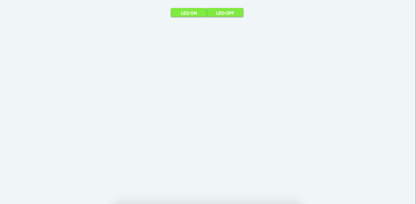
var dual = dualButton();
dual.first_button({name :"LED ON", action :"digitalWrite",
                   pin :"1", value :"HIGH"})
dual.second_button({name :"LED OFF", action :"digitalWrite",
                    pin :1, value :"LOW"})
Now save the file and open action page of the device and you will get the below output.
Extra customization
| Syntax | Parameter(s) | Description |
|---|---|---|
| bgcolor | color code | The bgcolor attribute specifies the background color of the button. The default color for the bgcolor is #9BDF46 . |
| shape | rectangle,circle | Shape property will specify the shape of the button. The default shape for button is rectangle. |
| dualButton(align); | left, center, right | It will create the object to create the button and you can pass the left, center or right as parameter to align the dual button. |
| text_color | color code | You can set the color of text using text_color parameter. The default text color is white. |
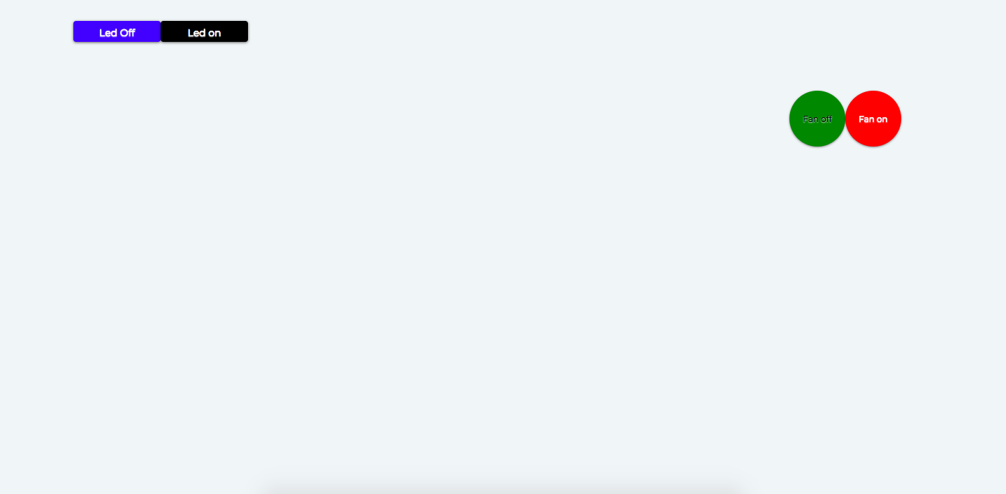
var dual =dualButton("left");
dual.first_button({name:"Led Off", action:"digitalWrite",
                  pin:"0", value:"LOW", bgcolor:"blue",
                  shape:"rectangle", text_color:"white"})

dual.second_button({name:"Led on", action:"digitalWrite",
                    pin:"0", value:"HIGH", bgcolor:"black",
                    shape:"rectangle", text_color:"white"})


var dual2 =dualButton("right");
dual2.first_button({name:"Fan off", action:"analogWrite",
                  pin:"0", value:"0", bgcolor:"Green",
                  shape:"circle", text_color:"black"})

dual2.second_button({name:"Fan on", action:"analogWrite",
                    pin:"0", value:"250", bgcolor:"Red",
                    shape:"circle", text_color:"White"})
Now save the file and open action page of the device and you will get the below output.
Sound on Button click
You can add sound effects on the click of the control button. By default, there is no sound enabled for the control button.
Syntax
sound:"sound file name with file extension"
To enable the sound property on single button, use the sound attribute of singleButton object.
Example
singleButton({name:"Led On",
              action:"digitalWrite",
              pin:"0",
              value:"HIGH",
              sound: "meme.mp3"})
Similarly, you can use the sound property in dualButton object.
Example
var dual = dualButton();
dual.first_button({name :"LED ON",
                  action:"digitalWrite",
                  pin :"1",
                  value :"HIGH",
                  sound:"spaceship.mp3"})
dual.first_button({name :"LED OFF",
                  action:"digitalWrite",
                  pin :"1",
                  value :"LOW",
                  sound:"vintage.mp3"})
Default sound files
Below is the list of default sound files name that you can use in the sound property.
- spaceship.mp3
- vintage.mp3
- industrial.mp3
- meme.mp3
- machine.mp3
You can see the list of default sound files in the assets section of Bolt Cloud. You can not delete the default sound files from the assets section.
Updated almost 3 years ago
