Prediction Graph (Beta)
Bolt cloud not only allows you to collect and store the sensor data but also allows you to predict future sensor values. This will allow you to take pre-emptive action.
Use case: Pharmaceutical manufacturing
If you are monitoring the tempratre and humidity in a pharmaceutical manufacturing plant, you may now get alert before the temperature crosses the threadhold. This will help you prevent the wastage of manufactured pills.
How does it work?
The prediction system on the Bolt cloud is achieved using the 'Polynomial Regression' algorithm. Polynomial Visualizer is a popular data analytics/ML algorithm which helps fit a non-linear curve to a given data set. The trend can be then used to understand where other data points might lie.The prediction algorithm on Bolt Cloud offers the following features:
- A graph that shows the past sensor values and also the future sensor values.
- 🚧 Integration with Alerts feature on the Bolt Cloud to send notifications in advance. 🚧 The alerts feature is under development and will be launched soon.
Beta Feature
This is a beta feature. We are working on adding more functionality to it.
In the current version, the predicted values are only stored on your browser. You will need to press the predict button again to generate the predicted values in case you refresh the browser.
Know the best model for you
- The prediction system on Bolt Cloud allows you to easily adjust the parameters.
- It also runs the algorithms for previous values to let you compare it it would have worked well for the data already collected.
The visualizer aims to help you decide whether a polynomial regression is a right way to go for your ML system, and in case the model works for the data then helps to find the best possible parameters to use with the model.
Adding Polynomial Regression to your Visualizer
- On the cloud dashboard, under the Products tab select the product for which you want to enable the Prediction Graph.
- Click on the configure, and go to the code section.
- Write the below code in the code editor, under the code section. Providing 'predictionGraph' as input to the set chart type function enables the Polynomial Visualizer function for the device view.
setChartLibrary('google-chart');
setChartTitle('Your Graph Title');
setChartType('predictionGraph'); /* This line adds the feature of ML*/
setAxisName('X-axis Name','Y-axis Name');
plotChart('time_stamp','your_variable_name');
- Save the changes and go the Devices tab.
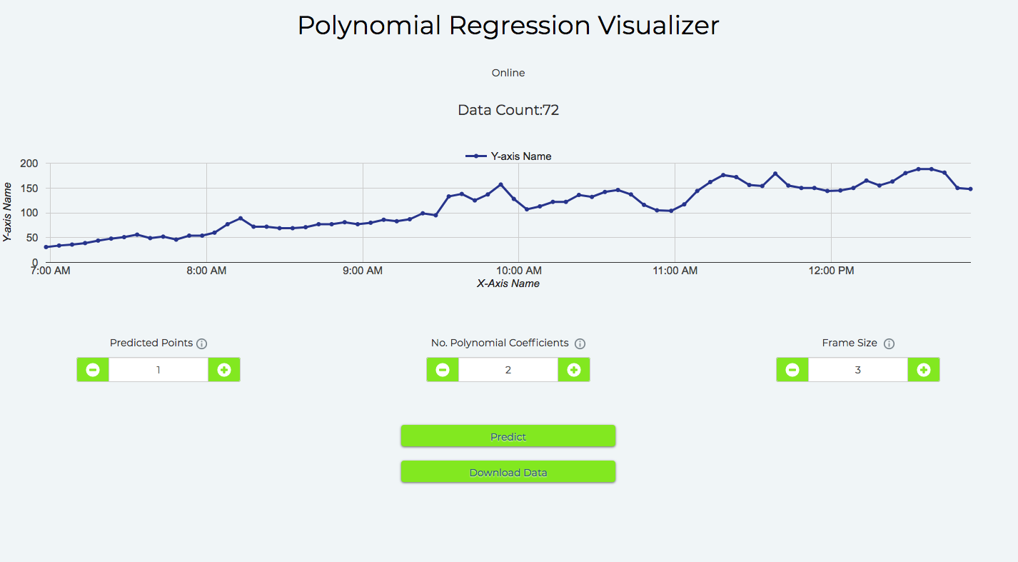
- Find the device that has been linked to the product and click on the view this device icon.After adding the tool to the device view, the Visualizer adds a 'Predict' button into the view, along with the fields that you can configure, as shown below.

Parameter of the algorithm
Here I will explain the parameters of the algorithm that you may alter to get the best results:
-
Predicted points:
- These are the number of future data points (sensor values) to be predicted.
- The Visualizer spaces the points with the data collection time in the hardware configuration of the product. So if you set the product to collect data every 5 minutes, and select 6 prediction points, the Visualizer will predict the trend and show 6 points up to 30 minutes into the future.
-
No. Polynomial coefficients
- Polynomial Visualizer processes the given input time-dependent data, and outputs the coefficients of the function of the form:

which most closely resembles the trend in the input data.
- This number tells the Visualizer how many elements should be present in the function, i.e. the value of n.
-
Frame Size
- These are the number of previous data points the Visualizer will use to predict the data trend. * For example, if you set this value to 5, the Visualizer will use the previous 5 points to predict the trend.
Understanding the graph
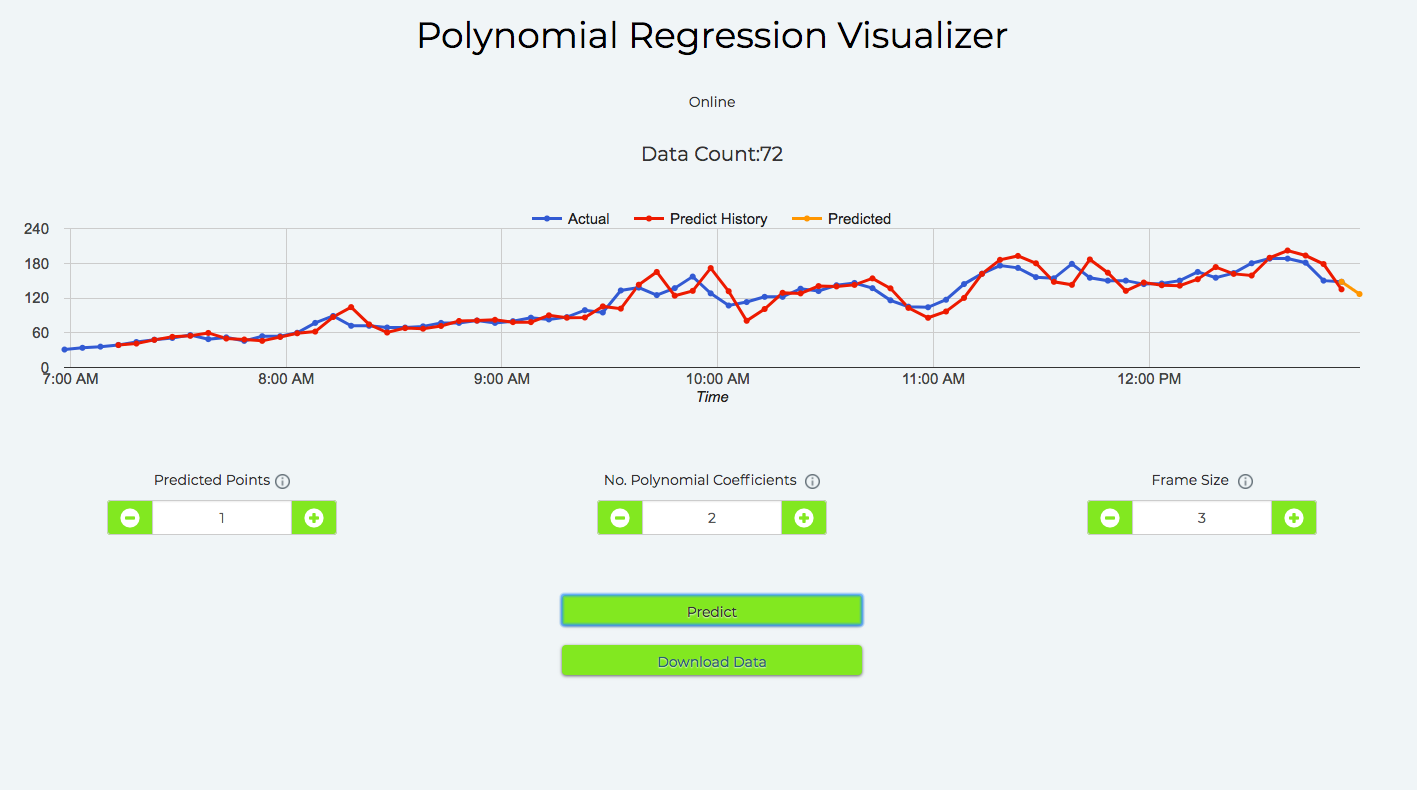
When you click the 'Predict' button, the prediction history two lines are added to the graph. One red and one yellow. These are in addition to the original blue lines.Blue coloured line: The actual data points.
Yellow coloured line: The future data points
Red coloured line: The prediction history. It is a graph of points the algorithm would have predicted, at the time with the data before that point in time, using the current settings. The red coloured line is helpful in quickly fine-tuning the algortithm.

Fine-tuning the algorithm
To get the algorithm perfect, you will have to adjust the parameters. The Bolt IoT platform helps you easily experiment with a trial and error system to finetune the parameters of the algorithm.
- Changing the parameters the algorithm mentioned earlier will change the prediction history and the next predicted trend.
- When a new data point is received from the Bolt, the data will be updated to the graph, along with prediction history and the next predicted trend.
- The closer the prediction history matches the older logged data, the better the future prediction of the data. Adjust the parameters till you get the most optimum graph where the predicted values match actual data logged.With the help of this graph, you can tweak the parameters of the algorithm. Since the Visualizer shows prediction history, you do not have to spend hours and hours to find out which set of parameters work best for your data. Thus, when you launch your polynomial Regressor for early alerts, you will know a ballpark accuracy of how it works in advance.
Avoid overfitting the data
Be very careful and do not over-fit your input data to the model.
Over-fitting is when the model is so closely tuned to the input data that it becomes inaccurate for new data points to be tested.
Watch this video to understand problems related to overfitting:
To avoid overfitting make sure your frame size is large enough.
🚧 Upcoming updates
Here are few updates that are coming soon for the Cloud Pro users:
- Predicted data stored on the server rather than the browser. This will let the system continue prediction even if you close the browser.
- Save the algorithm parameters (Not just the data) in the backend and not show the end-users
- You will be able to use send alerts based on your ML data.
- Anamoly detection over a simple GUI. This will be done using Z score analysis.
Updated 3 months ago
